
SELECTED PROJECT
Body Project
Brand identity · Website · Print
Creating an identity around movement, connection and change.
The Body Project takes an individual approach to movement, helping people better understand how their bodies move, where restrictions may occur, and how different parts of the body work together.
The new identity needed to reflect that thinking without relying on the familiar figures, leaves or wellness imagery often seen in the health and movement space.

01 / THE IDEA
Finding a visual language for connection.
The identity began with the idea of pathways.
Rather than representing the body literally, the concept explores movement, restriction and reconnection through a series of interconnected lines.
The result is an abstract brandmark that reflects the thinking behind The Body Project while leaving room for individual interpretation.


02 / THE IDENTITY
Precision without feeling clinical.
The Body Project sits between movement, rehabilitation and performance, so the identity needs to feel knowledgeable and considered without becoming medical or clinical.
A precise monoline brandmark, restrained typography and a natural colour palette create a visual identity that feels calm and contemporary while retaining strength and movement.
03 / DIGITAL
Bringing the new identity online.
The website extends the same calm, considered visual language while making The Body Project's approach easier to understand.
Clear pathways through Myofascial Release, Postural Alignment & Biomechanics, Sport Performance and Injury Rehabilitation help visitors find the information most relevant to them without overwhelming the experience.
The result is a digital presence that gives the brand space to breathe while keeping the focus firmly on the person seeking help.

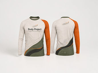
04 / IN THE REAL WORD
One idea, carried throughout the brand.
What began as a simple exploration of pathways became the thread connecting the identity as a whole.
Brandmark, typography, colour, print and digital all draw from the same underlying idea, creating a system that feels distinctive without needing to become complicated.
THE PROJECT
A clearer identity for a highly individual approach.
-
Brand strategy
-
Visual identity
-
Brandmark development
-
Typography + colour
-
Print collateral
-
Website design